Product Design
Intuit QuickBase, a complex cloud-based platform, long overdue for a UX overhaul. This product is rich with capabilities our enterprise-level customers couldn’t live without, and overly-complex features our smaller customers kept getting lost with. QuickBase offers a GUI — a rarity in the database-platform industry, but it had no aesthetic appeal, making it feel overly complicated and difficult to interact with. It also had no POV when it came to interactions and patterns, making learning a big source frustration for new users. This caused a ripple-effect of concerns for high-level corporations who needed to roll out their custom database tools to their organizations.
My team’s design goal was to give QuickBase one persona so that our customers could effortlessly "intuit" how to build their own databases, exactly as they needed them to be. With this came cohesive layout structures, information hierarchy, and responsive layouts.
The design approach centered around; user personas, a vision board, our brand story, defining our unique design principles, and a pattern library.
The result: We gained the attention of our organization and the Intuit Executive Team, who previously did not grasp the potential of QuickBase (many people thought it was only an internal tool). We created a partnership with the Corporate Brand teams as well as our Style Guide team.
First issue—internal awareness and budget approval.
Solution—show the organization the impact even the simplest changes could bring. Allow imagination to unleash.
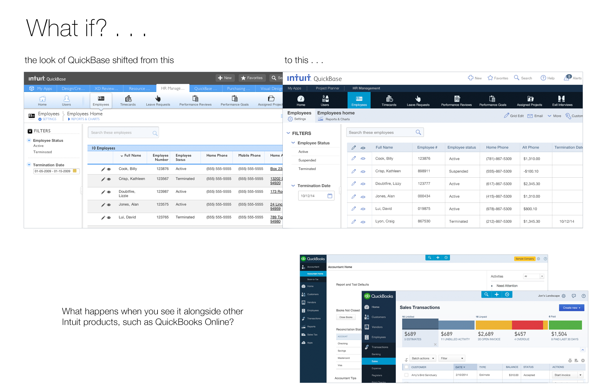
Our Basic Interface Design— This sketch communicates big-visual-design enhancements with minimal engineering effort.
We often fear change, even if we ask for it. This mockup was created to help our engineers and planning teams understand that visual upgrades didn't have to mean redesign. And, that dramatic improvements could be made with minimal impact and limited resources.
Customization Needs
Exploration of how a client (such as Puma) might customize their management portal, and how the same content might appear on a smaller screen.
App Building and Customer Permissions
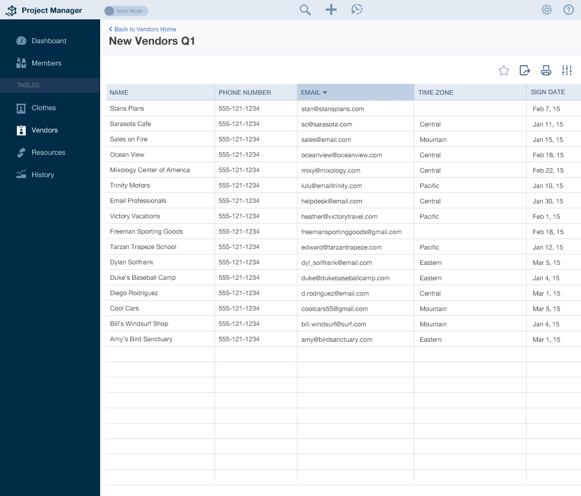
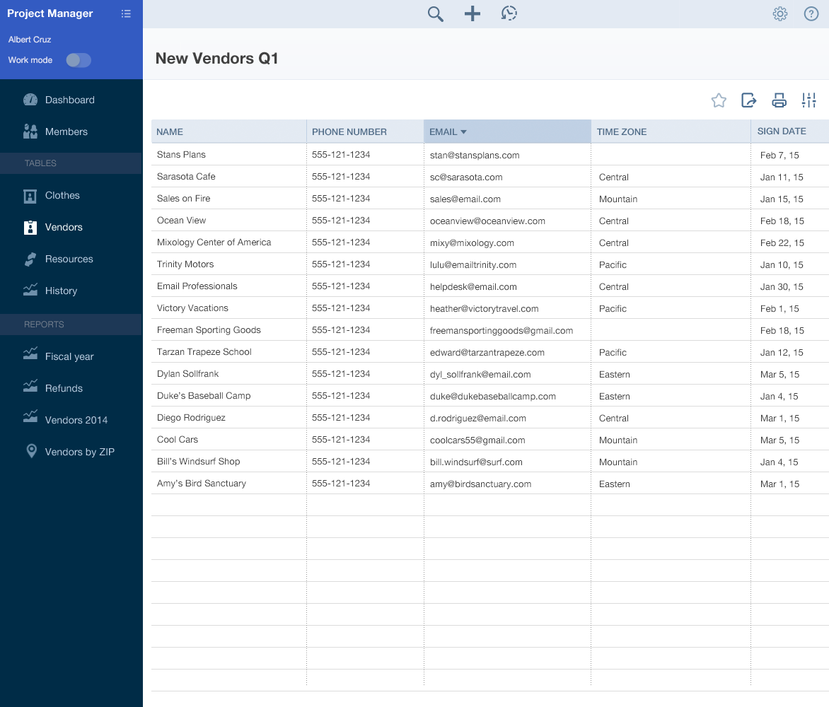
One of the largest pain points I observed in our customers, was moving from one application to another. It was cumbersome, and didn't offer the "work in multiple apps without losing your place" model that we had promised. I created a series of these sketches to resolve that issue. What you see here is high fidelity so that we could begin user testing and gain insightful feedback.
Mobile Experience
Onboarding, Guidance, and Education
Teaching is a passion of mine—not in a traditional lecture sense, but the cadence for delivering information. This proposal for on-boarding is designed to help customers see that QuickBase is complex, but manageable.
Our product had no broad-overview. I designed this one-pager to help our customers understand documentation more easily. Sometimes people just need orientation, not lessons.
Scenarios + Specifications
Above and below are examples of spec work for new product features. They detail a few key functions, and a variety of states. They are created for engineers and product managers, and paired with a more detailed write up.


